- Load the R Package we will use.
- Quiz Questions
Replace all the instances of ‘SEE QUIZ’. These are inputs from your moodle quiz.
Replace all the instances of ‘???’. These are answers on your moodle quiz.
Run all the individual code chunks to make sure the answers in this file correspond with your quiz answers
After you check all your code chunks run then you can knit it. It won’t knit until the ??? are replaced
The quiz assumes that you have watched the videos, downloaded (to your examples folder) and worked through the exercises in exercises_slides-73-108.Rmd. Knitted file is here.
Question: e_charts-1
Create a bar chart that shows the average hours Americans spend on five activities by year. Use the timeline argument to create an animation that will animate through the years.
spend_time contains 10 years of data on how many hours Americans spend each day on 5 activities
read it into spend_time
spend_time <- read_csv("https://estanny.com/static/week8/spend_time.csv")
e-charts-1
Start with spend_time
THEN group_by year
THEN create an e_chart that assigns activity to the x-axis and will show activity by year (the variable that you grouped the data on)
THEN use e_timeline_opts to set autoPlay to TRUE
THEN use e_bar to represent the variable avg_hours with a bar chart
THEN use e_title to set the main title to ‘Average hours Americans spend per day on each activity’
THEN remove the legend with e_legend
Question: echarts-2
Create a line chart for the activities that American spend time on.
Start with spend_time
THEN use mutate to convert year from an number to a string (year-month-day) using mutate
- first convert year to a string “201X-12-31” using the function paste
- paste will paste each year to 12 and 31 (separated by -) THEN
- first convert year to a string “201X-12-31” using the function paste
THEN use mutate to convert year from a character object to a date object using the ymd function from the lubridate package (part of the tidyverse, but not automatically loaded). ymd converts dates stored as characters to date objects.
THEN group_by the variable activity (to get a line for each activity)
THEN initiate an e_charts object with year on the x-axis
THEN use e_line to add a line to the variable avg_hours
THEN add a tooltip with e_tooltip
THEN use e_title to set the main title to ‘Average hours Americans spend per day on each activity’
THEN use e_legend(top = 40) to move the legend down (from the top)
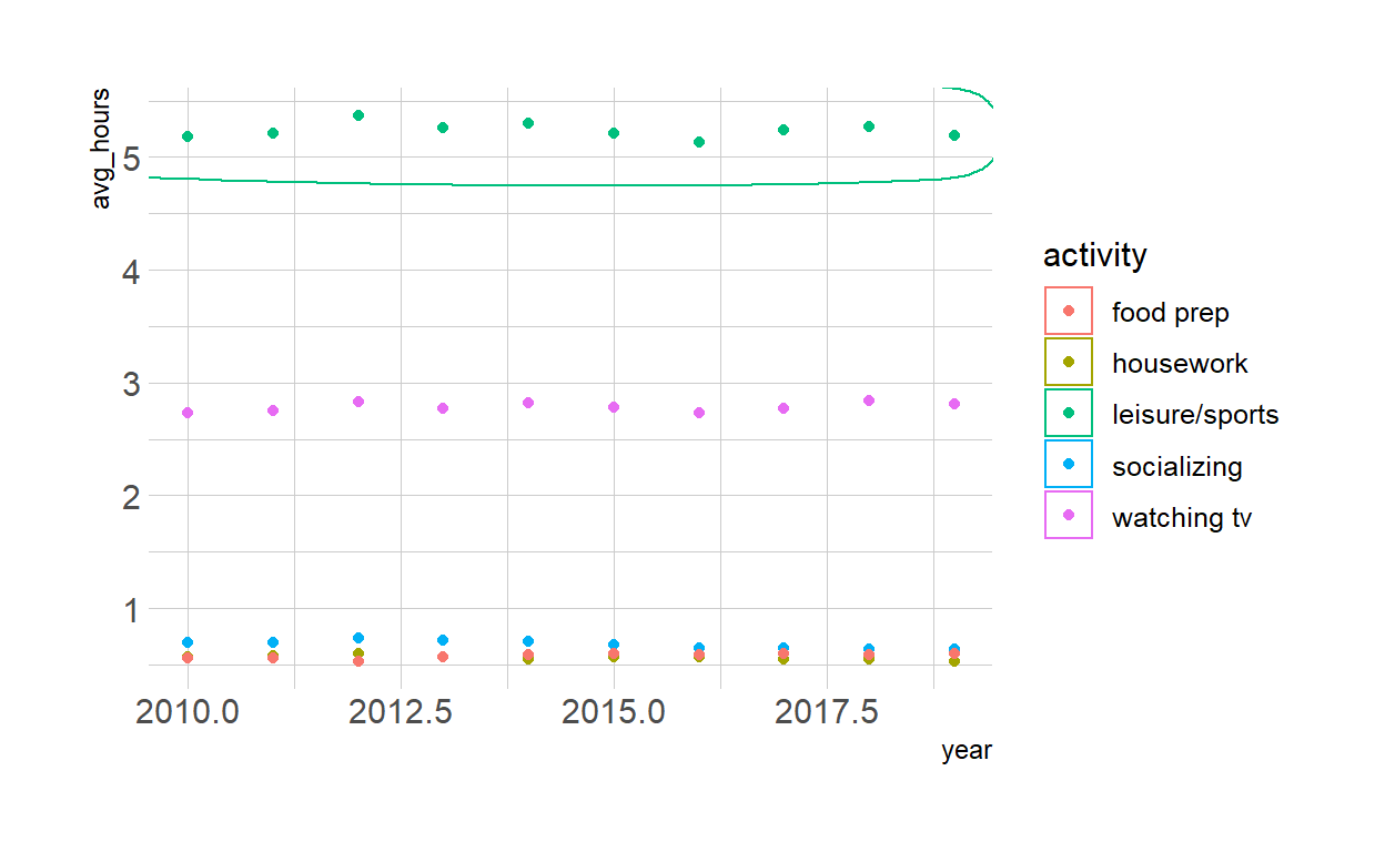
Question - modify slide 82
- Create a plot with the spend_time data
- assign year to the x-axis
- assign avg_hours to the y-axis
- assign activity to color
- ADD points with geom_point
- ADD geom_mark_ellipse
- filter on activity == “leisure/sports”
- description is “Americans spend the most time on leisure/sport”
 ggplot(spend_time, aes(x = year, y = avg_hours , color = activity)) +
geom_point() +
geom_mark_ellipse(aes(filter = activity == "leisure/sports",
 description = "Americans spend on average more time each day on leisure/sports than the other activities"))
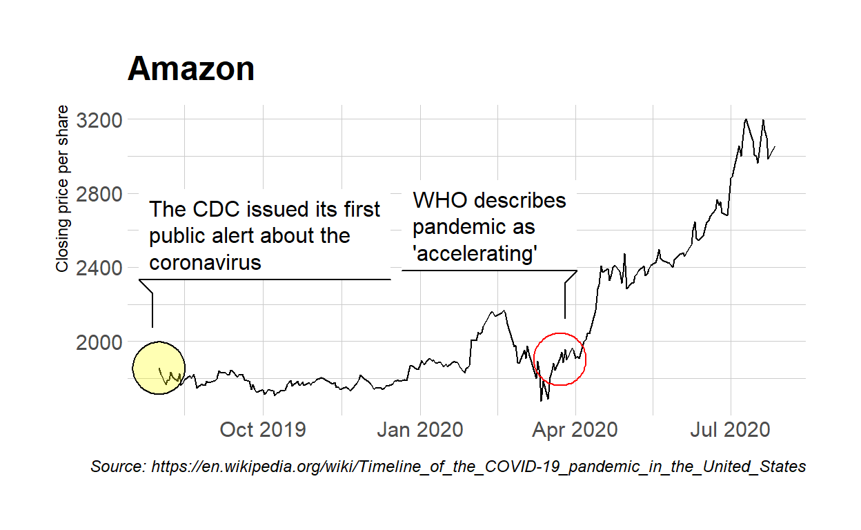
Question tidyquant
Modify the tidyquant example in the video
Retrieve stock price for Amazon, ticker: AMZN, using tq_get
- from 2019-08-01 to 2020-07-28
- assign output to df
df  <- tq_get("AMZN", get = "stock.prices",
          from = "2019-08-01", to = "2020-07-28" )
Create a plot with the df data
assign date to the x-axis
assign close to the y-axis
ADD a line with with geom_line
ADD geom_mark_ellipse
filter on a date to mark. Pick a date after looking at the line plot. Include the date in your Rmd code chunk.
include a description of something that happened on that date from the pandemic timeline. Include the description in your Rmd code chunk
fill the ellipse yellow
ADD geom_mark_ellipse
- filter on the date that had the minimum close price. Include the date in your Rmd code chunk.
- include a description of something that happened on that date from the pandemic timeline. Include the description in your Rmd code chunk
- color the ellipse red
ADD labs
set the title to Amazon
set x to NULL
set y to “Closing price per share”
set caption to “Source: https://en.wikipedia.org/wiki/Timeline_of_the_COVID-19_pandemic_in_the_United_States”
ggplot(df, aes(x = date, y = close)) +
  geom_line() +
  geom_mark_ellipse(aes(
    filter = date == "2019-08-01",
    description = "The CDC issued its first public alert about the coronavirus"
  ), fill= "yellow") +
  geom_mark_ellipse(aes(
   filter  = date == "2020-03-23",
    description = "WHO describes pandemic as 'accelerating'"
  ), color = "red", ) +
  labs(
    title = "Amazon",
    x = NULL,
    y = "Closing price per share",
    caption = "Source: https://en.wikipedia.org/wiki/Timeline_of_the_COVID-19_pandemic_in_the_United_States"
  )
Save the previous plot to preview.png and add to the yaml chunk at the top
ggsave(filename = "preview.png",
       path = here::here("_posts", "2021-04-19-data-visualization"))